
Read and Gain
March - April 2023
Website redesigning of Studiare app, a web app that gives chance for readers and learners to earn redeemable points while they read premiuim books for free.
User research, personas, sketches, wireframing, prototyping.
In an attempt of the management of Studiare to expand its only library services,and improve the current user experience, I was confronted with the current system and design brief. According to a preliminary investigation I carried out, the current studiare app appears to be rated relatively low by 60% of its's users, having a clumsy interface, undefined controls, and poor navigations. There for in addition to adding the Podcast, and E-Publisher sections, I designed a suitable solution to the problem.
Lookig at the project scope, coming up with the most suitable UX/UI solution for the case scenario was very challenging. Generating a user centric design is one of the best ways to achieving the goal. This include well defined user journey, simplified navigations, elegant design element and streamlined payment process. Introducing into the design the new functionalities of the Podcast and E-Publisher sections is also considered as part of the solution.
In order to gain a comprehensive understanding of the users of Studiare, I conducted extensive user research, incorporating surveys and interviews to comprehend their preferences and pain points. Utilizing analytics, I tracked online behaviors, and performed usability testing to observe interactions with the existing platforms. This thorough approach guarantees a nuanced understanding of user needs, serving as a foundation for making informed and effective design decisions.
I commenced the research phase by analyzing data collected from user interviews. This allowed me to grasp the difficulties individuals face when searching for their ideal food ordering app and to pinpoint common issues frequently encountered in this process.
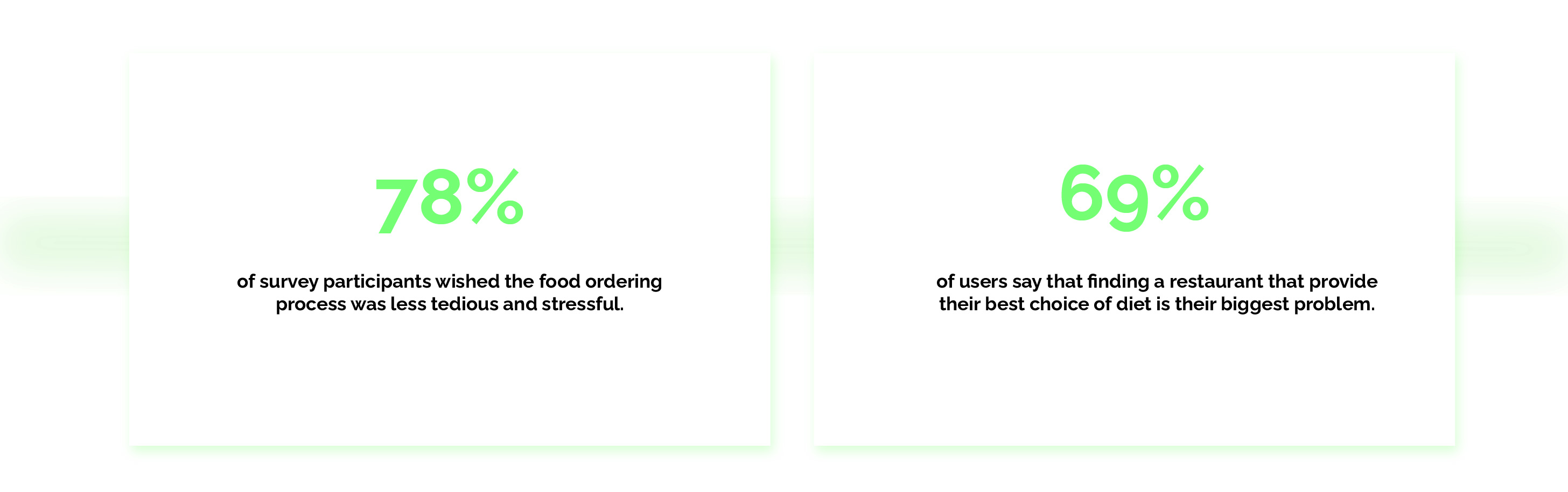
Here are some observations derived from the data collected during my research:
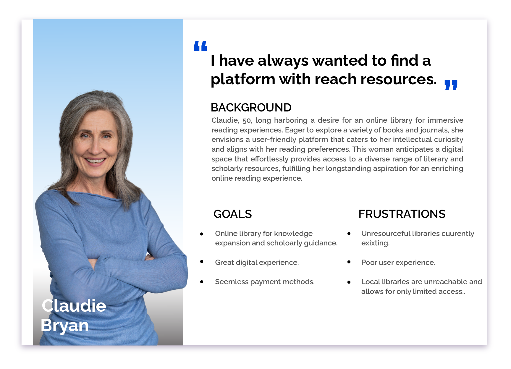
Having derived insights from user research, the next step involved crafting personas to visualize the target audience.
This persona conceptualize an elderly woman, who have retired and now spending most of her time in redeaing journals and books.
As a subject matter for this project, her instance is used in this entire project to depict the most suitable
solutions, with her age group being the most users of the app.
Starting the design phase, I began with initial sketches outlining the intended page layout. The objective was to empower users to search for listings based on location, navigate and filter through various parameters, and bookmark listings of interest. These features are illustrated in the accompanying sketches.
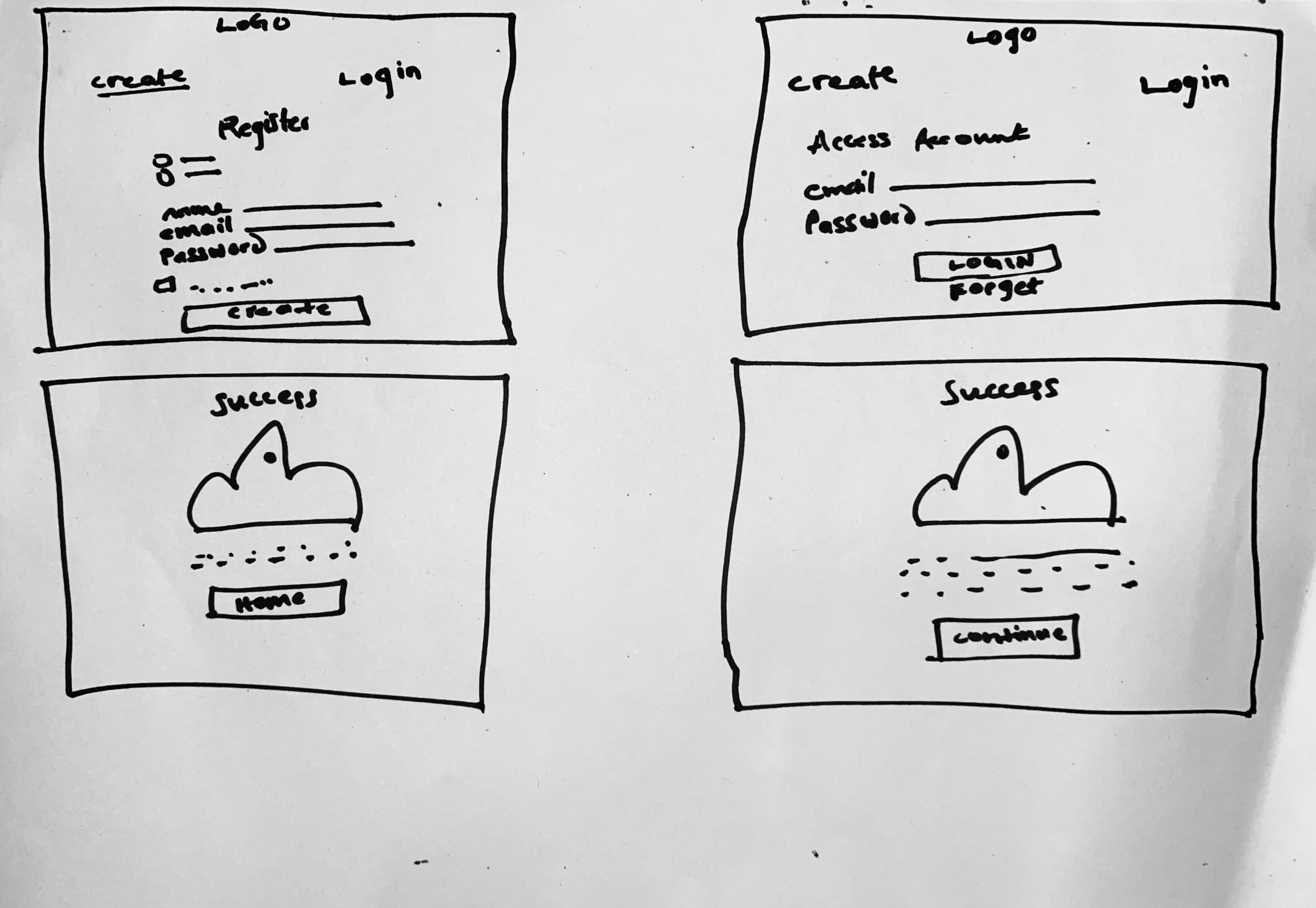
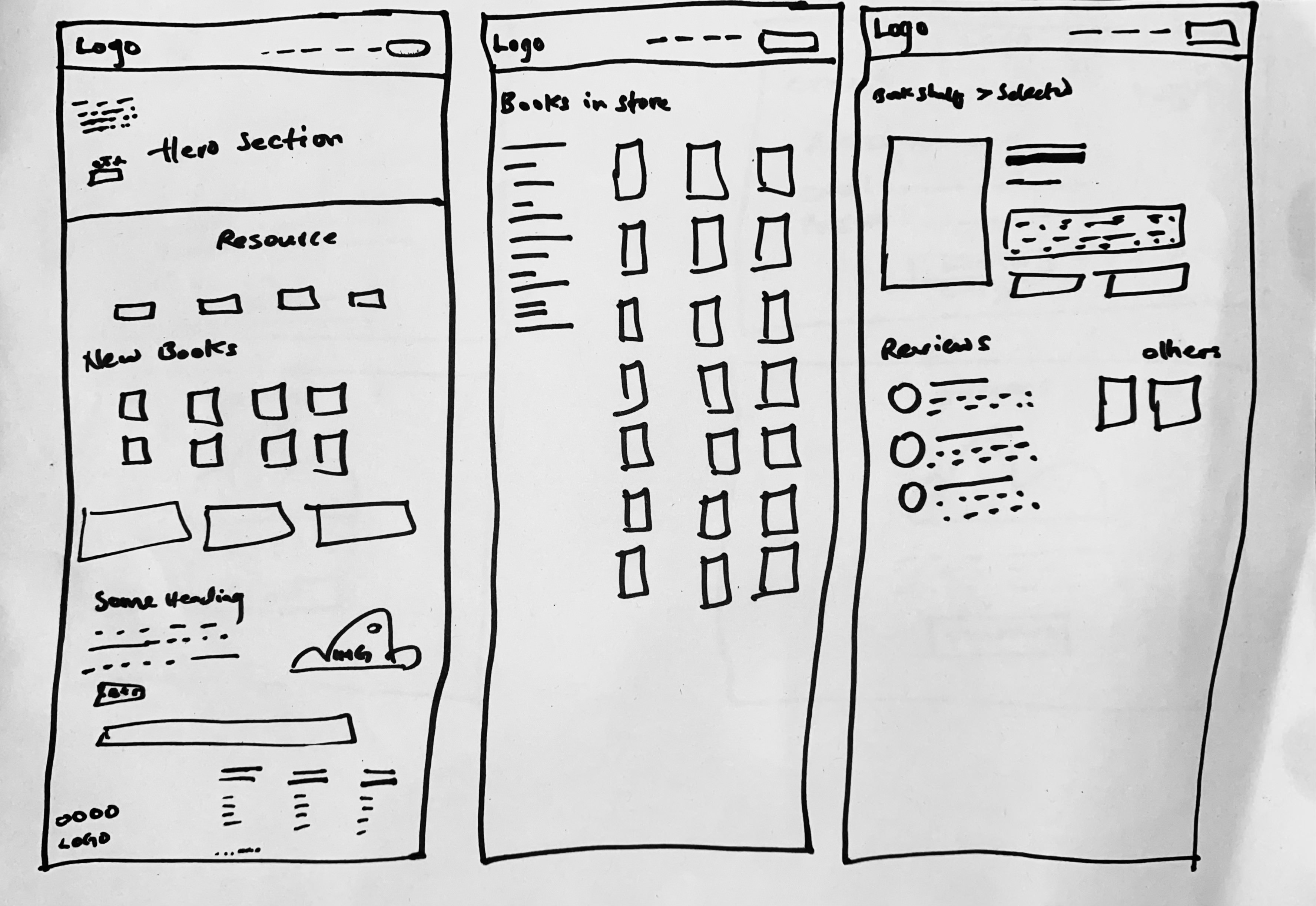
With the sketches in place, the next step involved crafting low-fidelity wireframes for the website. Subsequently, these wireframes were transformed into low-fidelity prototypes, providing a swift understanding of the cohesive flow between each screen.
Having established the wireframes, the subsequent stage was the creation of low-fidelity mockups for the website. These wireframes were then converted into low-fidelity prototypes, offering a quick comprehension of the seamless flow between each screen.
Prior to advancing to high-fidelity mockups, I conducted an unmoderated usability study, assessing the low-fidelity prototype with three participants. The subsequent improvements were incorporated, informed by valuable user feedback.
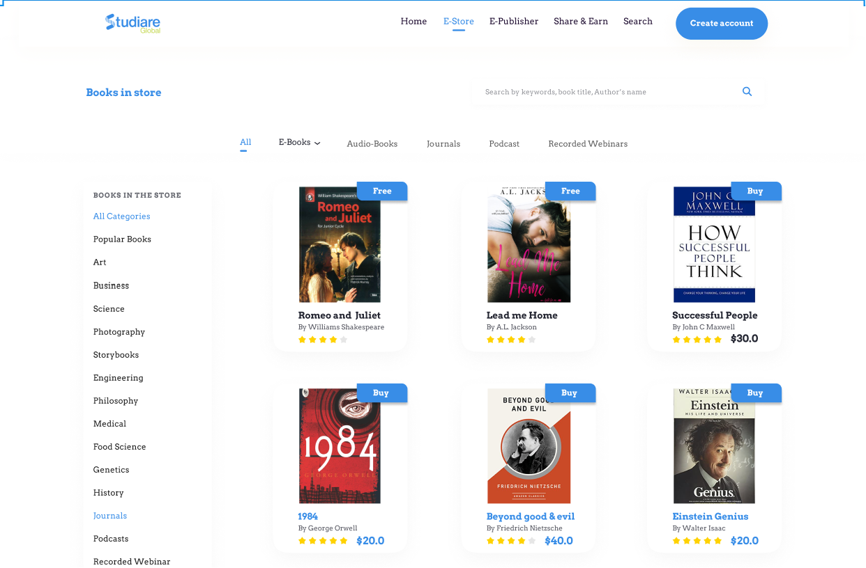
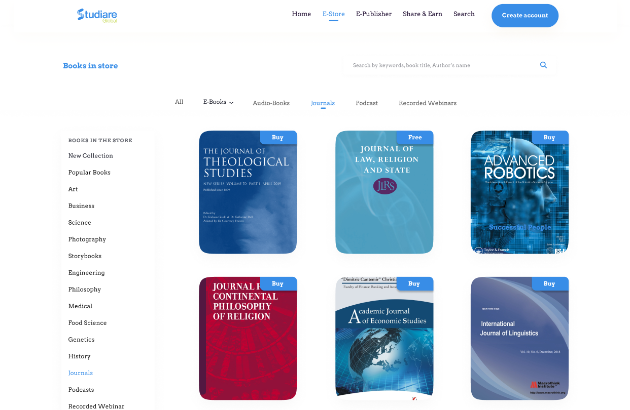
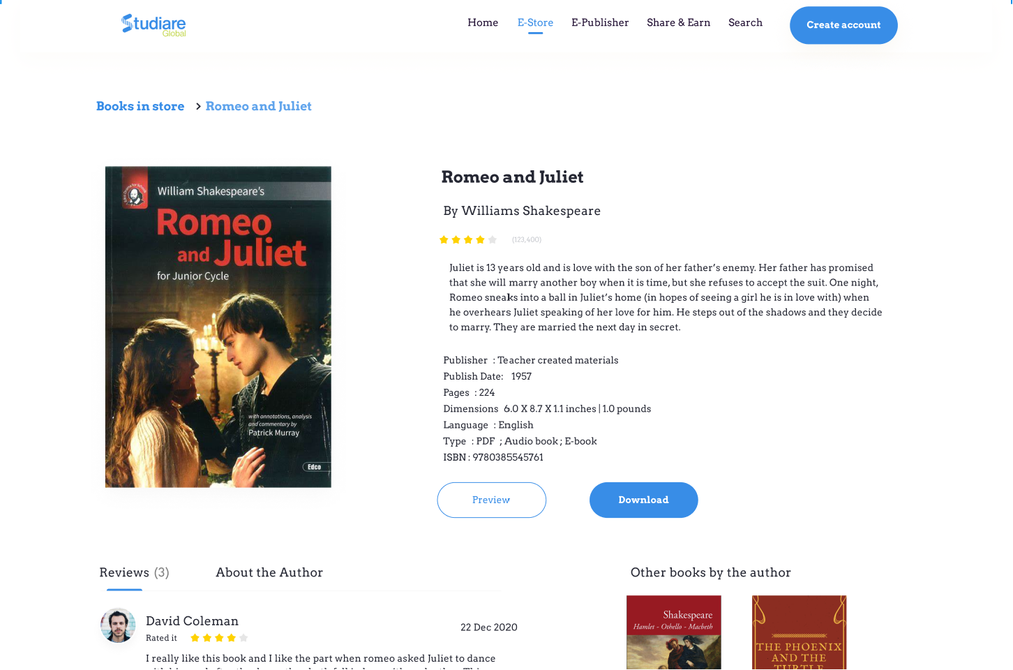
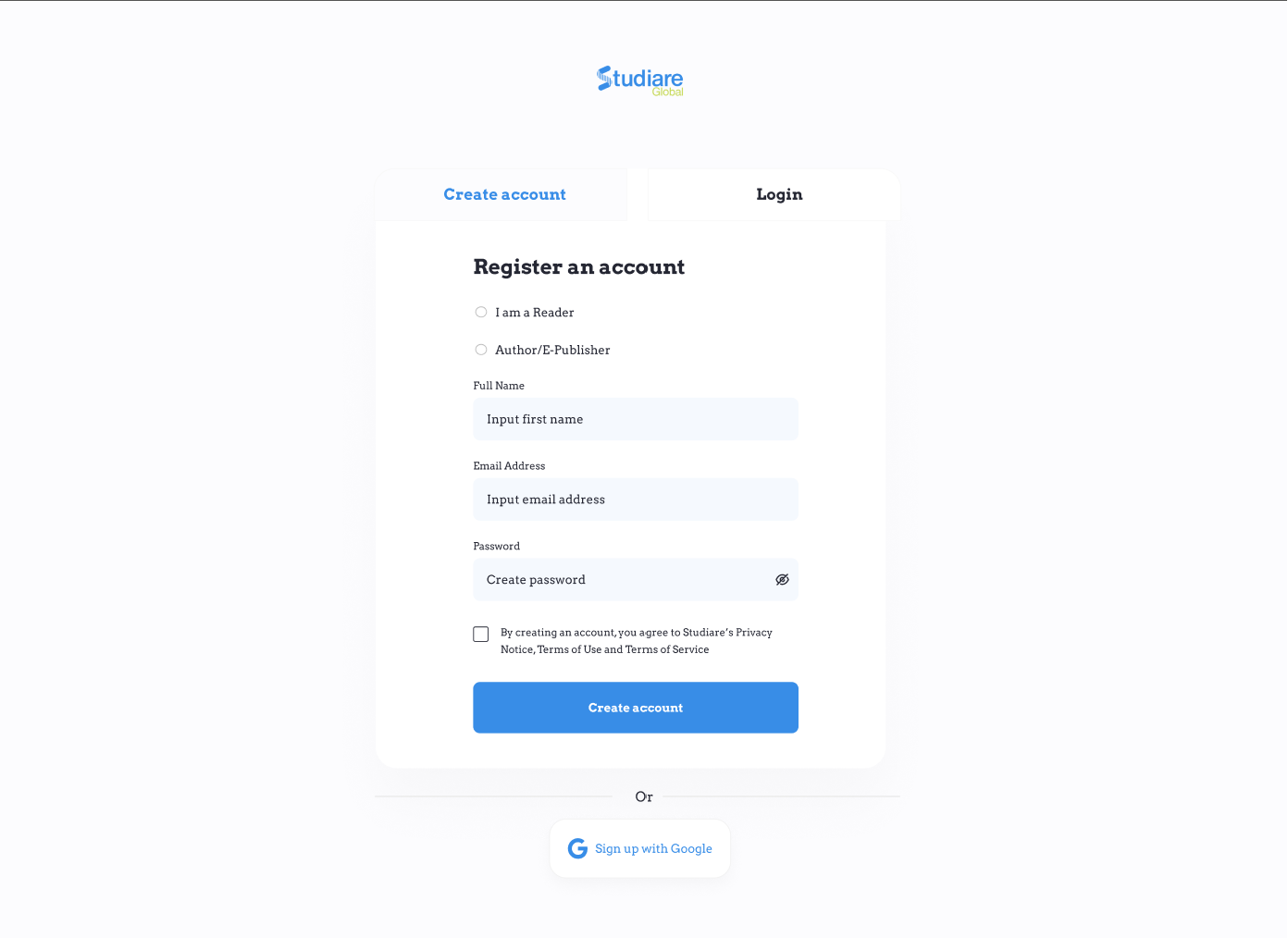
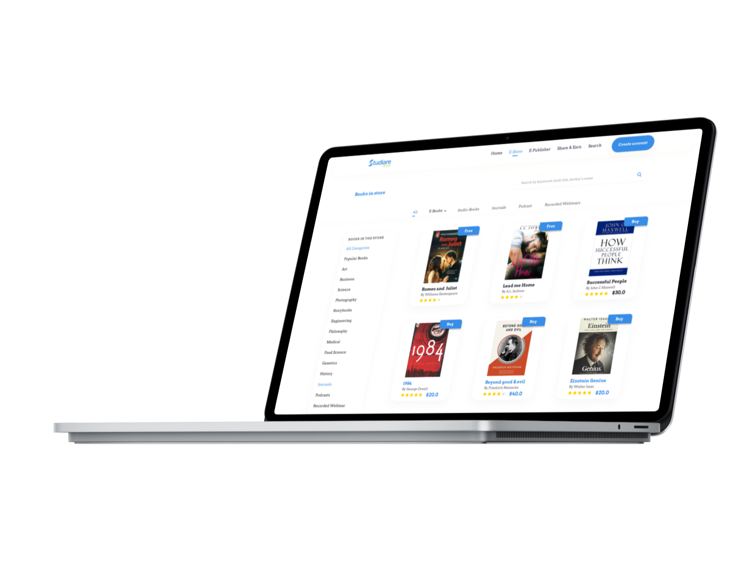
Haven updated the design with the user feedback, and refined the prototype, the definitive design is now concluded. Acknowledging the
inherently challenging nature of the online library process, the website strives for a simple, streamlined interface to
provide users with a hassle-free experience.
Evaluate the ultimate high-fidelity prototype beneath. Press F on your keyboard or click the maximize icon in the
top right corner for full-screen mode. Additionally, use the shortcut R to reset the user flow.